

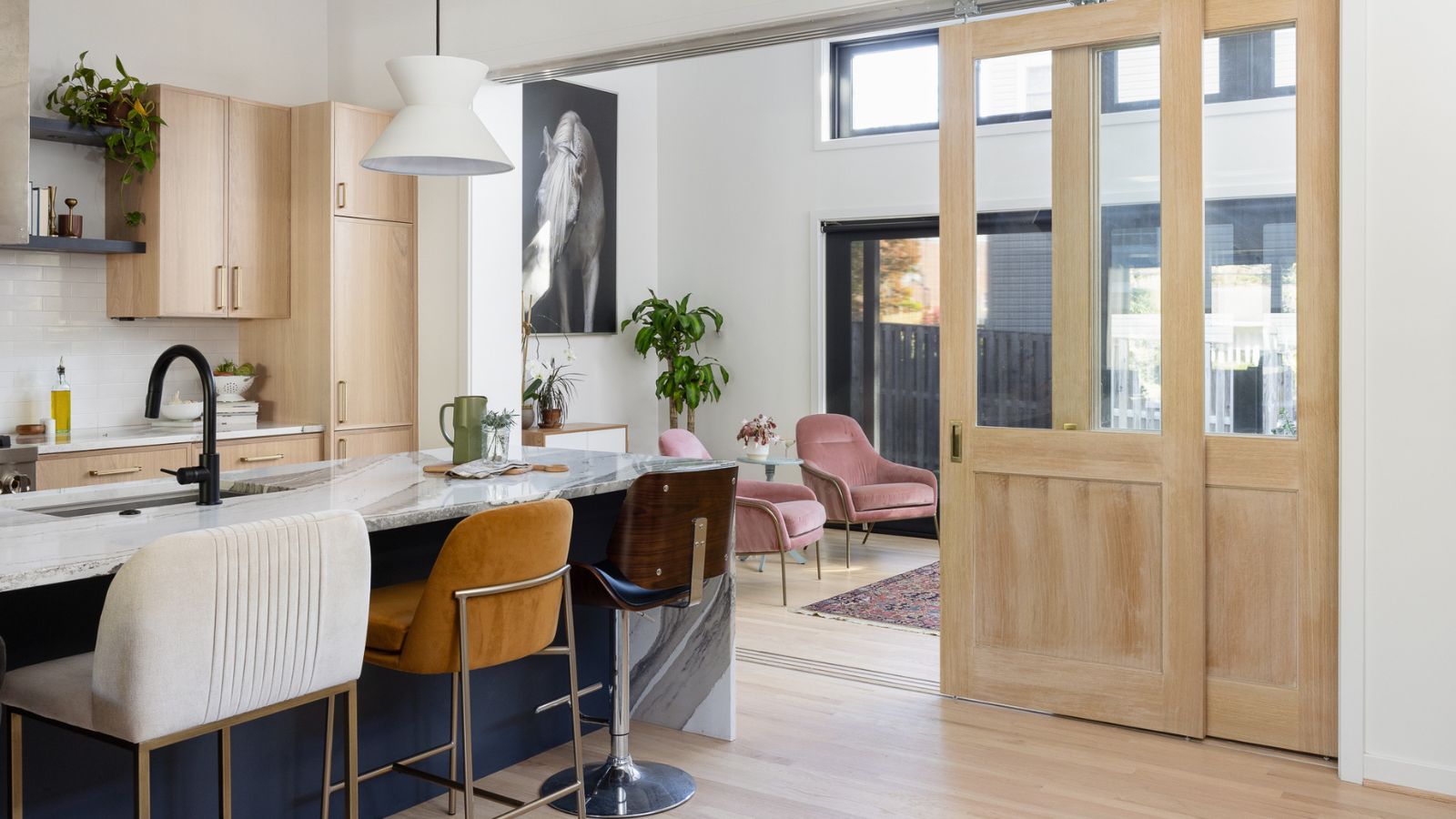
The most common regret in kitchen design is not about the layout. It is about the colour. A homeowner who spent months deliberating over door profiles and stone options goes quiet when asked about the kitchen five years later. The shade that felt fresh and current when the showroom presented it now reads as a dated marker of a particular moment rather than a timeless design decision.
This is not a small problem in financial terms. Kitchens are expensive to replace. The joinery that carries the colour you are reconsidering represents a significant proportion of the total kitchen investment. And unlike a bedroom wall that can be repainted over a weekend, replacing kitchen cabinetry because the colour no longer appeals is a major renovation in its own right.
The question of how to choose kitchen colours and materials that genuinely endure is therefore one of the most practically important in the entire kitchen design process. It requires understanding the difference between what is popular right now and what has proven staying power across decades of residential design. It requires understanding how different materials and colours behave in the specific conditions of an Australian kitchen. And it requires making choices that serve both present enjoyment and long-term satisfaction.
The Difference Between Trends and Enduring Colour Decisions
Kitchen design, like fashion, operates in cycles. Colour directions that feel fresh and desirable at the start of a cycle can feel predictable and dated by the end of it. The challenge for homeowners is that kitchen renovations are timed to their own logic, not to the design trend cycle, and a kitchen designed and built at the peak of a particular trend is the one that looks most obviously of its moment in a few years’ time.
The practical filter for distinguishing trend-driven choices from enduring ones is to ask a different question from “what looks good right now?” The better question is “what has consistently looked good across multiple generations of kitchen design?”
The answer, in almost every tradition of quality residential design, centres on a relatively small set of principles:
- Neutral or natural base tones that do not read as belonging to a specific period
- Contrast that is created through material texture and quality rather than colour alone
- Natural materials in prominent positions, since they age with character rather than dating abruptly
- Restraint in the application of accent colours, using them in replaceable or recoverable positions
This framework is not about blandness. Some of the most beautiful kitchens in the world are also among the most quietly restrained. The visual interest comes from the quality of the materials and the precision of the execution, not from the number of contrasting colours at play.
Hampton Kitchen Design: Why Its Colour Choices Have Proven Staying Power
The Hampton kitchen aesthetic has demonstrated a staying power in Australian residential design that few other styles can match, and a significant part of the reason is its approach to colour. The palette is not neutral in the sense of being colourless. It is composed with a specific logic that explains why it ages gracefully.
The foundation is a soft white or warm off-white for the primary cabinetry. Not a bright, clinical white, but a tone with warmth and slight depth that reads as fresh in any light without being tied to a specific moment. This foundation works because it is associated with quality and cleanliness across multiple design traditions and multiple generations.
The contrast in a well-specified Hampton kitchen design typically comes from a deeper tone applied to the island or lower cabinetry: navy, forest green, charcoal, or a rich blue-grey. These colours have a long design history and a quality of depth and richness that does not date the way more trend-specific colours do.
The material choices layer another level of visual interest that is not colour-dependent: marble or marble-look stone with genuine veining character, polished nickel or brushed chrome hardware in classic profiles, and where timber appears, it tends toward mid-tones that complement rather than compete with the cabinet colours.
This combination is why Hampton kitchens installed a decade ago still read as appropriate and considered today, while kitchens that chased more aggressively trend-driven colour combinations from the same period often feel more dated.
The Material Decisions That Outlast Colour Trends
Colour gets most of the attention in kitchen design conversations, but material quality is what determines how a kitchen looks and feels as it ages. The right materials develop character and patina over years of use. The wrong ones simply deteriorate.
The materials that consistently perform best in Australian residential kitchens over the long term:
Stone benchtops. Natural stone, particularly marble and granite, ages with genuine character. The veining and variation that can feel almost too dramatic when a slab is first installed often becomes the element people love most about their kitchen over time. High-quality engineered stone with a convincing natural aesthetic also ages well, provided the surface is not a highly polished finish that shows wear marks readily.
Painted cabinetry. A quality painted finish on cabinetry, applied properly with the right substrate preparation, holds up well to daily use and can be refreshed with a repaint if needed. Lacquered or two-pack finishes are more durable than brush-applied paints but require professional application. The key is the quality of the finish rather than the colour itself.
Timber. Genuine timber, whether in veneer or solid form, ages with enormous character. Oak, in particular, has a warmth and grain quality that works with almost any kitchen aesthetic and develops a beautiful patina with use. Engineered timber products are more stable in Australian climate conditions than solid timber and are often the better practical choice for benchtops and shelving.
Ceramic and porcelain tile. Quality large-format tiles for splashbacks and floors retain their appearance indefinitely and can be cleaned with genuine aggression. The grout is the weak point; choosing an epoxy grout for kitchen applications significantly reduces the maintenance burden.
For Perth homeowners exploring the full range of kitchen designs and material combinations available from quality local designers, a showroom visit where materials can be handled and assessed in person provides information that no photograph or swatch card can replicate.
How Australian Light Conditions Should Influence Your Colour Choices
Perth and much of coastal Australia experience a quality and intensity of natural light that is fundamentally different from the northern European and North American contexts in which many kitchen colour palettes were originally developed. Colours that look sophisticated in a London or New York context, photographed in soft, diffused northern light, can look harsh, washed out, or simply different under Perth’s direct, high-intensity sunlight.
The practical implications for kitchen colour decisions in Perth:
Cool-toned whites read colder in intense light. Pure, blue-toned whites that look clean and crisp in low-light northern hemisphere contexts can feel stark and clinical under Perth’s clear, direct sunlight. Warm whites and off-whites with a slight cream or yellow undertone tend to soften in strong light rather than intensifying.
Dark cabinet tones need natural light balance. Deep navy, charcoal, or forest green cabinets create beautiful contrast in a well-lit kitchen, but in a space with limited natural light, they can make the kitchen feel closed and heavy. In Perth homes with generous glazing and good natural light, these tones work beautifully.
High-gloss finishes amplify Perth’s light intensity. A high-gloss white or pale kitchen in a sun-drenched Perth home can be genuinely dazzling in a way that is fatiguing over time. Matte and satin finishes manage the reflection from strong natural light far more gracefully.
Natural material tones warm up in sunlight. Timber, honed stone, and natural texture-rich materials look better, not worse, in strong natural light. Perth’s sunlight brings out the warmth and depth in these materials in ways that artificial or diffused light simply does not achieve.
The Kitchen Design Styles Worth Considering for Long-Term Satisfaction
Understanding which kitchen design styles have proven their longevity is useful context for homeowners trying to make choices that will still feel right in a decade.
The styles that consistently demonstrate staying power are those built on timeless principles rather than temporary popularity: an authentic use of natural materials, a considered material palette with genuine contrast, craftsmanship that is visible in the details, and a relationship to the specific home and lifestyle that grounds the design in something more durable than trend.
Reviewing the complete range of kitchen design styles available in Perth, including Hampton, Scandinavian, contemporary, and other established directions, with this longevity lens gives a more useful basis for decision-making than asking simply which direction is most popular at any given moment.
The question worth asking at every stage of the design process is not “does this look current?” but “does this look considered?” Considered design, grounded in quality materials and genuine design logic, ages with grace. Current design, chosen primarily because it feels of the moment, rarely does.
Conclusion
Kitchen colour and material decisions are among the most consequential in any renovation, and the consequences are felt over many years rather than just in the immediate aftermath of completion. Getting them right requires looking past the present moment and asking which choices have proven staying power across multiple design generations.
The Hampton style’s endurance in the Australian market is a useful case study in what this looks like: a restrained palette built on warm whites and classic contrast tones, anchored by natural stone and quality joinery, and detailed with hardware that references established design traditions rather than chasing contemporary novelty.
Whatever the specific aesthetic direction chosen, the underlying principle is the same: choose materials for how they age, choose colours for how they perform in your specific light conditions, and choose designs for the quality of the thinking behind them rather than the volume of current conversation about them.